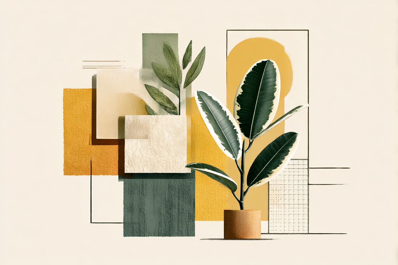
Most people associate biophilia with plants and natural light. However, there is a much more profound aspect of biophila occurring within your brain’s response to colour and pattern – specifically to colours and patterns that occur naturally in our environment.
Your brain was developed in environments rich in natural colour – such as greens, blues, earth tones and sky inspired hues. As a result, when you see these colours, your nervous system perceives them as “safe” and “natural.” Furthermore, your body reacts in a manner that is fundamentally different to a wall painted with a sage green versus a wall painted grey. This difference is not due to personal preference or aesthetics; rather, it is due to neurobiological differences.
Nature-inspired colour and pattern combinations are used in biophilic design to reduce stress, enhance cognitive abilities and promote overall wellness. The use of nature-inspired colour and pattern combinations utilizes frameworks, such as Terrapin Bright Green’s 14 Patterns, which demonstrate an average 6-15% improvement in productivity and up to a 60% improvement in mood as described in ecological valence theory, which states that humans have a predisposition for natural colours and patterns that mimic their natural surroundings.

One of the most cost effective and accessible ways to implement biophilic design into any setting is to utilize colour and pattern strategically. While many may believe that a renovation is required to implement biophilic design, nothing could be further from the truth. What is necessary is an understanding of both colour theory and neuroscience.
The Neuroscience of Colour
Your brain does not simply perceive colour passively. Exposure to colour elicits a series of measurable and reproducible neurological and physiological responses.
Melatonin Circadian Effects: Blues and greens can reduce melatonin production by 94-98% regardless of colour temperature. Therefore, using blues and greens in the morning will help regulate your circadian rhythms while using reddish hues in the evening will provide a calming effect to assist with falling asleep.
Stress Response and Cortisol: Research indicates that nature-mimicking colours decrease cortisol levels. In addition, brighter, more luminous tones were rated 36% more visually comfortable for visual comfort than darker contrasting tones in experimental settings. Additionally, as previously stated, exposure to colours found in nature has been shown to decrease cortisol levels. Therefore, it is no wonder that hospital rooms painted with soft greens and blues are associated with improved patient outcomes. The colour itself is therapeutic.
Biophilic palettes reduce stress responses by 60%. According to controlled studies, low-VOC paints in earthy schemes have also improved air quality and healing.
Cognitive Function and Mood: Studies have demonstrated that workplaces that incorporate biophilic colour and patterns exhibit 15% increased creativity and 6% increased productivity, according to a report from Human Spaces across 16 countries.
Additionally, research conducted on fractals demonstrated that people consistently prefer mid-complexity fractals (not overly simple or overly complex). Mid-complexity fractals evoke feelings of being in harmony with nature.
Organic shapes: Curves, spirals and other organic shapes found in nature should be used in place of sharp angles and rigid geometric patterns. When surfaces, furniture and wall treatments use curves as opposed to right angles, the space will feel less institutional and more biophilic.
Layering and Depth: Patterns that produce visual depth – whether through colour gradation, layering or texture – prevent flatness and monotonous colours. A wall with a single solid colour is boring. A wall with a combination of subtle colour variations, texture and/or layered patterns is visually interesting.
Colour Psychology: The Specific Hues That Work
Not all colours are equally biophilic. Understanding which colours trigger which responses helps you design strategically.
| Colour | Wavelength | Circadian Effect | Stress Response | Best Use | Avoid For |
|---|---|---|---|---|---|
| Sage Green | 500-550nm | Mild melatonin suppression | Cortisol reduction (25-30%) | Living rooms, bedrooms, offices | High-stimulation tasks (too calming) |
| Forest Green | 500-530nm | Moderate melatonin suppression | Strong stress reduction (30-40%) | Offices, commercial, feature walls | Spaces needing high alertness |
| Sky Blue | 450-495nm | Strong melatonin suppression (90%+) | High stress reduction (35-45%) | Offices, creative spaces, morning exposure | Bedrooms (too alerting at night) |
| Ocean Blue | 480-495nm | Strong melatonin suppression | Stress reduction via water association | Offices, spas, meditation areas | Bedrooms late evening |
| Terracotta/Earth Orange | 600-650nm | Minimal suppression | Warmth, grounding (mood lift 15-20%) | Accent walls, creative spaces | Large wall areas (can feel overwhelming) |
| Warm Taupe/Greige | 590-620nm (warm) | Minimal melatonin effect | Neutral grounding, safe | Foundational colour, large areas | Stimulation or energy (too neutral) |
| Charcoal/Dark Grey | Broad spectrum | Minimal melatonin effect | Can increase stress if too dark | Accent walls only, not primary | Large areas (creates cave effect, increases stress) |
| Bright White | Full spectrum | Strong melatonin suppression | Neutral to slightly stimulating | Task spaces, clinical | Living/relaxation areas (harsh, sterile) |
The practical rule: Use greens and blues as your primary palette. Add warm accents (terracotta, warm wood tones) for grounding. Avoid large areas of dark or bright colours that lack natural reference.
Practical Application: Room by Room
Bedrooms:
Primary: Soft sage green or pale blue
Accent: Warm taupe or soft terracotta (one wall or trim)
Pattern: Subtle fractals or organic shapes, minimal large-scale patterns
Why: Soft greens/blues in the evening trigger melatonin (aiding in sleep) while providing a soothing and relaxing environment.
Home Offices:
Primary: Warm taupe or neutral greige
Accent: Sky blue or forest green (one wall, behind desk)
Pattern: Moderate fractals, organic curves in furniture/accessories
Why: Neutral base eliminates distractions while green/blue accents provide focus and creativity.
Living Rooms:
Primary: Warm greige or light forest green
Accent: Terracotta, warm wood tones or sky blue (multiple accent areas)
Pattern: Layered fractals, organic textiles, nature-inspired artwork
Why: Warm tones invite comfort and relaxation while green/blue promotes relaxation and variety eliminates monotony.
Commercial Offices:
Primary: Neutral greige or light warm taupe
Accent: Sky blue or forest green (strategically placed behind collaboration areas)
Pattern: Moderate fractals, clean organic shapes, avoid overstimulation
Why: Neutral base provides focus while blue/green accents provide focus and balance between professionalism and biophilia.
Retail/Hospitality:
Primary: Warm neutrals or light forest green
Accent: Terracotta, sky blue or warm wood tones (multiple accents acceptable)
Pattern: Rich fractals, layered textures, nature-inspired motifs
Why: Richer colour palette invites guests to linger while patterns add visual interest and warm tones provide a welcoming atmosphere.
Role of Light in Colour Perception
Here’s a critical point many people miss: the same colour appears dramatically different under different lighting conditions.
Earthy neutrals with accents have been shown to increase well-being by 15-25%. Forty-four percent of workers would prefer working in a natural light paired scheme for motivation purposes. This is important as your colour selections must complement the lighting conditions in the space.
Natural Light: Colours appear most accurately under natural light conditions. A sage green that looks wonderful in natural light may look dull and depressing under fluorescent lighting.
Warm Artificial Light (2700K): Warms earth tones and warm colours, producing a more inviting atmosphere. Cool colours (blue, green) appear slightly dulled.
Cool Artificial Light (5000K+): Cool colours (blue, green) are enhanced while warm tones appear cold, creating a harsh and sterile atmosphere.
Colour Temperature Shifting: More advanced biophilic designs utilize lights that shift colour temperature throughout the day – i.e., warmer temperatures during the morning and evening hours and cooler temperatures during midday. This supports your circadian rhythm while allowing colours to appear more suitable for the time of day.
Practical Implication: Prior to painting a large area, acquire sample pots and test the colour in your actual lighting conditions at various times of the day. A colour that appears perfect at noon may appear completely unacceptable at 4pm, when the lighting conditions change.
You Might Also Like
Common Colour Mistakes
Pure Primary Colours (Bright Red, Yellow, Blue): These colours do not mimic nature and are therefore not biophilic. Earthly colours are typically more muted and have lower saturation. Bright primary colours are overstimulating when applied to large areas.
Failure to Account for Saturation: Desaturated (less saturated/muted) versions of colours are considered more biophilic than highly saturated versions. Nature does not contain neon green or electric blue. It contains sage green, forest green, sky blue and ocean blue. Desaturate.
Large Areas Painted Dark: Dark colours reduce perceived brightness and can increase stress in certain individuals. Utilize dark colours as accents only (one wall, trim, detail). Apply lighter and warmer colours to larger areas.
Matching Colour to Function: A meditation room painted in stimulating orange is working against biology. A focused work area painted in grey is working against productivity. Match colour to the intended function of the space.
Overlooking Texture and Pattern: A wall painted with a single colour can appear flat and institutional. Incorporate subtle texture through art or a single statement piece. This is what produces a sense of life and naturalness in a colour.
Omitting Undertones: Colours possess undertones. A green may have blue, yellow or brown undertones. These undertones are important. Forest green has brown undertones while sage green possesses blue undertones. Select undertones that support your objective – warmth or serenity.
Implementation: How to Use This Information
Step 1: Assess Your Space
What kind of light does the space receive? (Natural, warm artificial, cool artificial?)
What is the function of the space? (Sleep, focus, relaxation, socializing?)
What is your baseline currently? (Colours, mood, productivity if applicable)
Step 2: Select Your Primary Colour
Determine your primary colour based on the function and lighting in the space.
Acquire sample pots and apply the colour to the wall. Observe the colour at various times of the day. Wait 3-5 days prior to finalizing a decision.
Step 3: Select Accent Colour
Select an accent colour that complements your primary colour. Use as accent wall or trim. Provides visual interest without becoming overstimulating.
Step 4: Add Layers Through Pattern and Texture
Apply subtle fractals through art, textiles or architectural features.
Utilize organic shapes in furniture and accessories. Avoid rigid geometric shapes.
Step 5: Test and Refine
Reside with the colours for 1-2 weeks.
Monitor how you react to the colours at various times of the day.
Modify if necessary (lighter, warmer).
Paint and Material-Specifics
When selecting paint and materials, give priority to the following:
Low-VOC Paints: Biophilic palettes with low-VOC paints in earthy schemes enhance air quality and healing. Traditional paints release chemicals for months. Low-VOC paints limit this. Cost is marginally higher but worthwhile for health reasons.
Natural Finishes: Matte finishes appear more natural than glossy. Matte finishes reduce glare and create a softer appearance. Eggshell is a reasonable middle ground between durability and a natural appearance.
Texture: Consider textured finishes (faux finish, rough texture) that mimic natural surfaces. A smooth wall appears artificial. Minimal texture adds depth.
Natural Materials: To the extent possible, utilize natural materials (wood, stone, clay) as opposed to artificially created materials. These have colour variations and texture that cannot be replicated with man-made products.
2026 Trends and Evolution
In terms of colour integration in biophilic design, 2026 trends indicate biophilic colour incorporation will yield a 13% higher level of satisfaction among users and compliance with WELL standards for melanopic lux (150-275 EML). The field is transitioning toward biophilic colour integration that is both measurable and intentional and not merely aesthetically pleasing.
Emerging Approaches:
Circadian-Responsive Colour Systems: Lights that shift colour temperature throughout the day to support the user’s circadian rhythms.
Personalized Colour Palettes Based on Circadian Type and Lighting Conditions: Create colour palettes that are tailored to the individual’s unique circadian needs and lighting exposures.

Integration of Colour and Air Quality Monitoring: Develop colours that adjust based on the user’s indoor air quality.
Biophilic Patterns Derived From Local Nature: Design biophilic patterns that derive from the surrounding flora and fauna of the location.
The Future of Colour Integration: Strategically Designed Colour and Pattern vs. Randomly Selected Colour and Pattern.
How to Begin
If you are not prepared to undergo complete renovations, begin with the following:
Select one accent wall and paint it with a biophilic colour (depending upon the function of the room and its lighting). Add a small amount of texture through art or a single statement piece. Monitor your reaction to the colours for 2-3 weeks.
Colour is one of the least expensive methods of implementing biophilic design. Painting is less costly than purchasing plants and requires less maintenance, yet yields a quantifiable and instantaneous improvement in mood and productivity.
Dr. Priya is an Environmental Psychologist who received her PhD from the University of Washington after conducting eight years of research that investigated how biophilic designs affect the human body at the biological (neurological) level. Her research has been published in peer-reviewed journals that discuss how biophilic designs reduce cortisol levels, improve sleep quality, and increase cognitive functioning in biophilic environments. In addition, she is currently consulting with architects and designers to assist them in using evidence-based practices when they implement biophilic design principles.
Dr. Priya bridges the gap between academic researchers and practicing architects/designers. As an academic researcher, she possesses a high degree of knowledge regarding the science behind biophilic design. However, as a writer, she is able to translate the complex neurobiological data into clear and concise language that explains why biophilic design is effective.
Dr. Priya believes that biophilic design should be established as a foundational element to all “healthy” buildings and is working to move past the trend of “wellness” and toward creating a fundamental understanding of the importance of biophilic design.
Dr. Priya writes the “research heavy” articles that provide a detailed look into the actual results of research studies that examine the effectiveness of biophilic design. These articles focus on what research studies indicate; what claims made by others are unsubstantiated; what types of interventions have the most substantial evidence supporting their use; and what is still unknown regarding the impact of biophilic design. She is diligent in ensuring that each article is referenced appropriately and methodologically correct; however, she also provides clarity for those without scientific backgrounds.