Walking through the Amazon Spheres in Seattle last Tuesday, I couldn't help but think about how far we've come from those awkward "plant walls" that dominated corporate lobbies fifteen years ago. You know the ones – those sterile vertical gardens that looked more like green wallpaper than actual living ecosystems. The Spheres are something else entirely. Three interconnected glass domes housing over 40,000 plants from around the world, creating what Amazon calls a "living laboratory."
But here's what struck me most: watching people interact with the space. I mean, really interact. Not just snapping photos for Instagram (though there was plenty of that), but actually slowing down.

Sitting on benches for extended periods. Having longer, more thoughtful conversations. Kids pressing their faces against the glass barriers, trying to spot the tree frogs hidden among the bromeliads.
This isn't accidental. Every element was designed to facilitate these deeper connections with nature. The temperature gradients, the humidity levels, the carefully orchestrated soundscape of flowing water and rustling leaves – it all works together to create what researchers call "restorative environments." Places where our nervous systems can actually downshift from the constant hypervigilance of urban life.
I've been documenting spaces like this for years now, and honestly? The Amazon Spheres represent a massive shift in how corporations think about employee wellbeing. This wasn't just about creating an impressive visitor attraction (though it certainly does that). Internal studies showed employees who regularly used the space reported improved focus, reduced stress levels, and stronger feelings of connection to their workplace. Hard metrics that justify the $4 billion investment.
Of course, not every organization can build geodesic rainforests. But the principles scale beautifully. Take the renovation I consulted on for a pediatric dental practice in Portland last year. The original space was… well, let's just say it wasn't helping anxious kids feel any calmer. Sterile white walls, fluorescent lighting, that distinctive medical office smell that somehow combines disinfectant with fear.
Working with a tight budget (aren't we always?), we focused on three key interventions. First, we replaced the ceiling-mounted fluorescents with LED panels that mimicked natural daylight cycles – brighter and cooler in the morning, warmer and dimmer as the day progressed. Sounds simple, right? But the impact on both staff and patients was immediate. Parents started commenting on how much more relaxed their kids seemed in the waiting area.
Second intervention: living walls. Not the complicated hydroponic systems that require specialized maintenance contracts, but simple modular planters mounted at varying heights. We chose plants specifically for their air-purifying qualities and ability to thrive under artificial lighting – pothos, snake plants, spider plants. Nothing exotic or difficult. The kids love them, though we've had to replace a few after curious toddlers decided to help with the "watering."
Third – and this one really made the difference – we created visual connections to the existing outdoor courtyard. The previous layout had positioned the reception desk with its back to the windows. We flipped the entire arrangement so that families checking in could see trees and sky instead of a blank wall. Such a simple change, but follow-up surveys showed a 40% reduction in pre-appointment anxiety scores.
The most inspiring example I've encountered recently isn't even a building – it's the High Line in New York. I know, I know, everyone talks about the High Line. But stick with me here. What makes it extraordinary isn't just the clever repurposing of abandoned rail infrastructure. It's how the designers created what feels like a continuous natural experience within one of the world's most built-up environments.
Walking the length of it last fall, I paid attention to how the planted areas weren't just decorative additions but functional ecosystems. Native grasses and wildflowers that actually support urban wildlife. Seasonal changes that mark time's passage in a city where it's easy to lose track of natural cycles. Benches positioned to frame specific views – sometimes of plantings, sometimes of the Hudson River, sometimes of the urban canyon below.
You Might Also Like
The genius lies in the choreography. You're never just walking through a park – you're experiencing a carefully orchestrated journey that alternately reveals and conceals, that creates intimate spaces within a very public setting, that connects you to both natural processes and urban energy. It's biophilic design operating at an urban planning scale.
But let me tell you about my favorite small-scale example: a renovation in my own neighborhood that perfectly demonstrates how biophilic principles can transform everyday spaces without breaking the bank. The owner of a corner coffee shop decided to close for two weeks last spring to address what she called "the vibe problem." Customers weren't lingering. The space felt harsh and unwelcoming despite decent coffee and reasonable prices.
I spent an afternoon there before the renovation, taking notes. The issues were obvious once you knew what to look for. No natural light – the windows were mostly blocked by equipment and signage. Hard surfaces everywhere – concrete floors, metal furniture, exposed ductwork. And zero connection to anything living or natural.
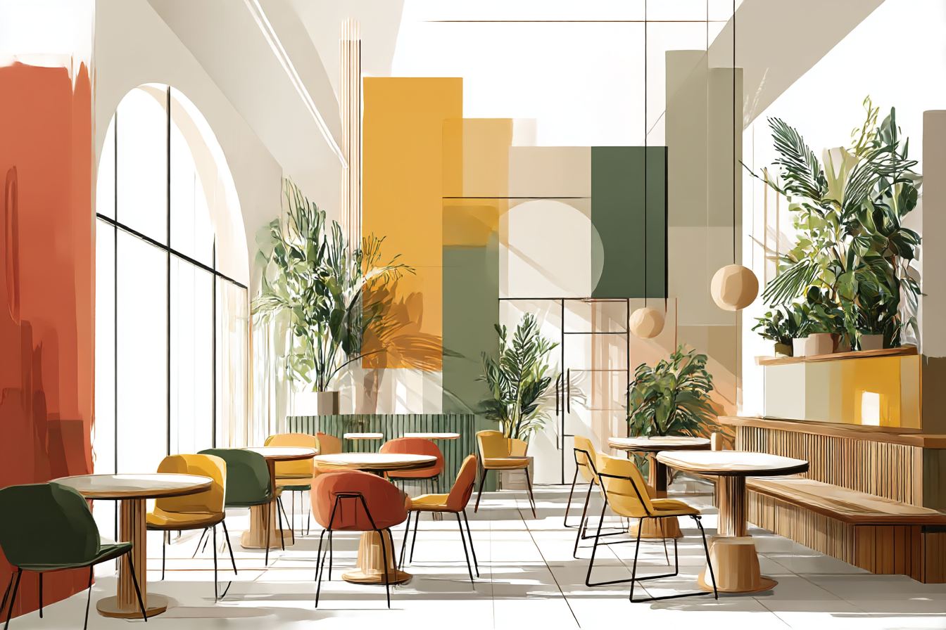
The transformation was remarkable in its simplicity. She removed the window coverings and rearranged the layout to maximize natural light penetration. Added warm wood elements – reclaimed barn wood for tabletops and shelving that customers could actually touch and feel. Introduced plants throughout the space, not just token succulents on windowsills but substantial planters that created natural room divisions and improved air quality.
The piece de resistance? A small water feature – basically a tabletop fountain – that provided just enough background sound to mask street noise without overwhelming conversation. Nothing fancy, but it created what acoustics experts call "pink noise" – the kind of natural sound that actually helps people focus and relax.
The results speak for themselves. Average customer dwell time increased by 65%. Revenue jumped 30% in the first quarter after reopening, and not because of price increases. People were simply choosing to spend more time there, ordering additional drinks and food, meeting friends, working on laptops.

The space had become what urban planners call a "third place" – somewhere between home and work where community connections naturally form.
What I love about this example is how it demonstrates that biophilic design isn't about creating Instagram-worthy showpieces. It's about understanding how humans respond to natural elements and processes, then incorporating those elements in ways that serve both aesthetic and functional needs.
The coffee shop owner told me something that's stuck with me: "I didn't realise how stressed the old space was making me until we changed it. I actually enjoy being here now instead of just enduring it." That's the real measure of successful biophilic design – not awards or media coverage, but the daily experience of the people who inhabit these spaces.
These examples share common threads that anyone can apply, regardless of budget or building type. They prioritize natural light and views of nature. They incorporate living plants as functional elements, not just decoration. They use natural materials that invite touch and provide sensory richness. They create connections – visual, auditory, tactile – to natural processes and cycles.
Most importantly, they recognise that humans are biological beings with deeply ingrained needs for connection to the natural world. When our built environments honour those needs, everything else follows – improved health, enhanced creativity, stronger social connections, greater overall satisfaction with our daily lives.